Final Conclusion…The End

For my final post, I wanted to address the changes I made from my original proposal, explain what I have learnt along the way and state what I would change if I did another blog.

Changes made from the original proposal:

  • My original plan was to look at the marketing of theatre companies through their social media, but as the process unfolded, I found websites provided more material for me to give feedback on. I think that because of this shift, my blog will be more helpful for Reading Rep and others as it is less specific.
  • I reduced the number of companies to assess from six to four because I found that I was recognising the same issues and planning the same feedback from the websites. By reducing this number, I feel my blog is more direct and easier to digest.
  • The whole process ended up taking longer than my original December to January time frame. However, because of this extended time frame, I ended up looking into the website presentation of Proof and Out At Sea & Striptease, not just The Nativity Goes Wrong.

What I have learnt from this process:

  • I have learnt that I do not want to pursue marketing in the future- I feel that I need a more active and creative job.
  • I have benefited from the blogging process. I have learnt how to actually use a blog website and adjust my writing to suit this kind of media and the implied audience it brings.

Things I would improve if I did it again:

  • I would stick to my time frame. Due to personal circumstances over the Christmas holidays and my work load at University this term, the blog has taken longer than I had hoped.
  • If I did another blog, I would allocate more time to the presentation of it and I am not too sure if I would use wordpress.com again because unless you pay for premium, it is a challenge to upload photos. For most of my posts I needed photos to demonstrate my point. As a result, I find my posts too text heavy which is rather ironic, as that is a problem I have criticised others for in this blog.
  • If I did another marketing blog, I would like to learn more about the process of marketing. As my third post states, I learnt about S.W.O.T and P.E.S.T, but I would love to know more. I worry that my blog seems amateurish because of my limited experience and knowledge of marketing.

I wanted to conclude saying how useful this process has been for me. At times it has been challenging and repetitive, but nonetheless, a useful learning experience. I have benefited greatly from all of this and I now have more of an idea of what direction to take my career in.

I really hope Reading Rep find the feedback in this blog helpful. Thank you for letting me do this.
Conclusion- suggestions for Reading Rep

After assessing four other theatres, I am now going to give feedback on what I feel Reading Rep should do to improve their website for a customer.

Homepage- see http://www.everymantheatre.org.uk/

Everyman Home

Everyman Home

  • Reading Rep should move the links to their social networking sites from the bottom of the page to the top right hand corner. It would also be good to see a direct link to the Twitter feed on the homepage.
  • There are ten tabs across the top and I think this should be edited down to a maximum of six. For example, ‘Outreach’ and ‘Schools’ could become one tab, as could ‘Support Us’ and ‘Join Us’. At the moment the top panel is a lot to digest.
  • There is also some inconstancies with capital letters in this panel. It says ‘About us’ and ‘Plan your visit’, but other tabs read ‘Join Us’ and ‘Support Us’. This should be changed as it comes across as amateurish.

Productions- see http://www.nationaltheatre.org.uk/

National Theatre 'Productions' layout

National Theatre ‘Productions’ layout

  • I like that Reading Rep have an option to view past and current seasons on the website.
  • There are a few issues with the page about the current season:
    • I think that Proof and Out at Sea & Striptease should all be presented along the top of the page, so once you have selected ‘Productions’, the information is there instantly.
    • I feel that the 2013/14 season photograph gets in the way, it should be moved aside for the photographs and links to actual productions. (Specifically for this suggestion, see the National Theatre website, as this is done well there).

Box Office

  • This section is a really good part of the website as it is easy to negotiate and clearly laid out.
  • Eventually, it would be good to see Reading Rep have their own box office, but from a customer perspective, the external links do not give a bad impression or hinder purchases.

Plan Your Visit- see http://www.nationaltheatre.org.uk/

National Theatre 'Plan Your Visit'

National Theatre ‘Plan Your Visit’

Reading Rep are really let down by this section, but from my assessments of other theatres, I think they need to do the following:

  • Add a tab section
    • ‘Travel’, ‘Venue’, ‘Food & Drink’.
    • ‘Travel’- transfer the ‘By Foot’, ‘By Rail’, ‘By Bus’ and ‘By Road’ information to this tab.
    • ‘Venue’ – Provide more information about the seating arrangements at Reading College. Also add the ‘Access & Parking’ and ‘Address’ information.
    • ‘Food & Drink’- Reading Rep need to establish links with local restaurants and bars, such as the Abbot Cook and advertise them under this tab. It suggests to the customer that a visit to Reading Rep is more than just watching a play, but a day or evening out.

Social Media

Overall, this aspect is strong. It would be good to see a YouTube account/ a ‘Video Collections’ (see National Theatre) part of the website if Reading Rep have the time to manage it well.

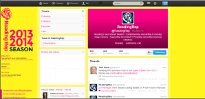
Reading Rep's Twitter Page

Reading Rep’s Twitter Page

  • Twitter- good colour scheme and consistent branding. There are regular updates and interaction with followers. Their following is small but that is to be expected from a young, regional organisation.
  • Facebook- similar kind of page to the Twitter. A good representation of what the theatre has to offer and it posts additional information that you do not find on the website.
  • RSS- this link has not worked on my computer.

National Theatre, London

National Theatre Homepage

National Theatre Homepage

The homepage of the National Theatre is instantly negotiable pointing to all the links you need. There are bright colours and the photographs of the productions are equally as attention seeking as each other, but complimentary when presented together on the page. There are two main panels- the top one directing you to the standard links; ‘Box Office’, ‘Discover More’, ‘Support Us’ etc. and the second panel at the bottom has links to the current productions. As a very busy theatre, this presentation works well. When you visit the ‘What’s On’ page, there are links to booking and more information about the productions. The only real criticism of the homepage is the inconsistent colour schemes, however, the layout of text and font is steady.

Box Office/ Shop

This tab is really useful and all the information you could need is provided. There is a best sellers panel and even opportunity to buy book copies of their productions. This part of the website is easy to negotiate and it is easy to spend money here!

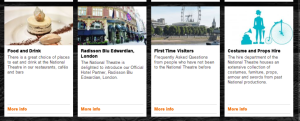
Examples of options to choose under the 'Plan Your Visit' tab

Examples of options to choose under the ‘Plan Your Visit’ tab

Plan Your Visit

This tab provides all the help you would need to plan a visit to the National Theatre; restaurants, costume hire, hotel links, venue and disabled access information. This page presents London in an approachable and friendly way, enticing the customer to visit the theatre and the establishments they have links with.

National Theatre 'Video Collections' page

National Theatre ‘Video Collections’ page

Social Networking

Instead of a link to an external YouTube account, the National Theatre have a ‘Video Collections’ panel on the website. This enables instant access, no hassle and full control for the company. The videos are presented in a collage style, showing a variety of video stills. This part of the website is original to the National Theatre, making them stand apart from their competitors I have looked at.

Of all the theatres I have looked at, the National Theatre’s Twitter account has the most followers; 143,000. There are regular updates from this account and the branding is transferred over from the website. However, there is little evidence of responding to customer enquiries and the overall tone is quite formal. No doubt the sheer size of their following provides a reason for their little interaction with customers, but it is something they should improve.

The impression gained from the Facebook account is much the same; they have just over 60,000 ‘likers’ with regular updates and consistent branding of productions. The Facebook account has links to individual pages for productions and areas of the company. For example, you can like ‘War Horse’ or ‘National Theatre Bookshop’. This means that advertising for the National Theatre extends beyond the one page.

Strengths: Their website is original and comprehensive. The ‘Video Collections’ and ‘Your Visit’ tabs are prime examples of this.

Weaknesses:They are a nationally renowned company and their website is relatively flawless. However, because of this size, simple customer care on Twitter and Facebook seems to go unnoticed.

Opportunities: The National Theatre should continue to work on the originality of their website.

Threats: As a nationally and internationally famous theatre, there are few obvious threats on the website to damage their reputation. However, they do need to monitor customer care and continue to be as creative as they are now, to ensure their position at the top.

Progress Theatre, Reading

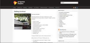
Progress Theatre Homepage

Progress Theatre Homepage

The first thought that came into my head when I visited the Progress Theatre’s website, is they do not do themselves justice. Progress Theatre is very well established in Berkshire; Sir Kenneth Branagh is their patron and the range of their productions is fascinating. However, their website lets them down:

  • The colour scheme, photographs and text lay out is dull. There is a very limited creative input.
  • They have a side panel directing you to helpful links on the right, but it is overcrowded and presented in black and white.
  • You have to search through the website to find out about Sir Kenneth Branagh’s involvement, which seems silly. His involvement is impressive and Progress ought to advertise this link better, to their advantage.
  • The website is also missing a ‘Your Visit’ page. As a local theatre company, it would be very helpful for customers to be directed towards The Riverside or local restaurants in Reading.

About Us

The basic function of this section is to tell the customer about their history, core values and objectives. The website is informative on these issues, but it is not presented in a way which entices you to read it, which is a shame because their history and objectives are interesting. This is because the website is very text heavy and the only photograph used is a particularly dull image of the theatre door.

Limited Progress Theatre Booking Options

Limited Progress Theatre Booking Options

Booking

Although the booking page has the same presentation issues, it is a useful page. The information provided is succinct and all the contact details needed are available. It is a shame there seems to be no option to book online, but perhaps that is a logistic or budgeting issue. There is however, a very helpful average ticket price table, which is useful if you are just making an enquiry, or for example if you are budgeting for a big group.

Community Involvement

Once again this page is very useful, but there is no visual enticement to read it. They explain the benefits of becoming a member, and how that can lead to an involvement in the productions. The price is clear and there are contact details.

Example of interacting with the public on Facebook

Example of interacting with the public on Facebook

Twitter & Facebook

There is a link in the top right hand corner of the website directing you to the Twitter which is useful. Progress Theatre have got the tone right on their page- it’s professional yet personal and gives their followers an insight into behind the scenes information. Although the cover photo and profile picture are not overly vibrant, they work well on the twitter and continue the website theme. However it would be good to see less linear images.

The Facebook page is of a similar standard, helpful, informative and with an inviting tone. Like the Twitter it is also updated regularly.

Strengths: An informative website and the basic information for a theatre goer is easy to find.

Weaknesses: The colour scheme and photographs are too basic, suggesting the content is dull. They also do not use their         patronage to their advantage much as they should. There is also no ‘Your Visit Section’ which would be helpful for a customer.

Opportunities: They should revamp the website, adding colour and new photographs. They could also write a blog about their relationship with their patron with a link to the website.

Threat: Visiting a dull website can turn away potential customers and members.

Everyman Theatre, Cheltenham

Everyman Home

Everyman Home

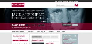
The first impression of the Everyman Theatre from the website is very positive. The website seems organised, well-structured and informative. I really like that there is a live link to the Twitter feed as it shows they are keeping up with  technologically and it is exciting to see what they are up to on other sites. The photographs used are vibrant and relevant, they also fit well with the consistent colour scheme and branding. One particular part I like, is the little calendar in the side panel on the left hand side. It makes it easy to see what is on, whatever tab you are looking at on the website.

Although the first impression is positive, I see a few issues. Although, the links to the Twitter are clear and helpful, they only link to the Twitter. It would be encouraging to see their involvement in other sites too. In addition, the side bar although informative, is quite overloaded, but they have broken up the information by separating the information with coloured headings.

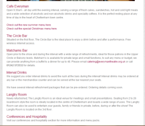
Food & Drink

Everyman Food & Drink

Everyman Food & Drink

It was nice to see they had information about different ways to get food and drink at the Everyman. This suggests that a visit to the Everyman can be an evening or a day out.  It was disappointing though that the Everyman was not linked with restaurants and bars outside of the theatre. I think it is nice to have that kind of link because it demonstrates community involvement. Hopefully the Everyman would be able to arrange some kind of sponsorship deal with the restaurants and as a local, I know there are some great local restaurants near the Everyman. I feel they are missing a good opportunity!

The information that is given about food and drink, is helpful but slightly limited. Customers are given the contact details of the different restaurants and bars so they can find out for themselves, but I think it would be nice to have a few examples of dishes or separate tabs for each place, like a micro-website.

Education

This section is very informative and clearly the theatre are doing lots of work within the local community. There are also helpful contact details to find out more information. I do find that this section is not as interesting as other parts of the website, as there is a large bulk of text. However, it is quite a serious part of the company and they have added some colour to add vibrancy and a continuation of the branding.

Booking Online/ Box Office

The booking experience was the smoothest out of the websites I have assessed. There was a range of reviews to aide your decision, a comprehensive list of performance dates and a very helpful seating plan which clearly stated the price ranges. In addition to this, there was also space to leave your thoughts on the production, information about booking by telephone, and the opening times of the box office at the theatre.

Everyman Twitter

Everyman Twitter

Twitter

The Everyman feed was not the most exciting that I have come across. I feel that considering that the Everyman is likely to be the most frequented theatre in Gloucestershire, their social media did let them down a little. There was no vibrant cover photograph; meaning that the positive visual impression you get from the website is not continued.They do tweet very regularly, but they only have around 5,000 followers. I feel that the posts are not hugely exciting and more focus on Twitter would be a good thing to do.

Strengths: One of the strongest theatre websites I have looked at for this study. Great photographs and consistent colour schemes. The website is very easy to use and it provides lots of information and contact details if you need more. Most of what you need is on the home page.

Weaknesses: Side panel is slightly overloaded with links. The social media is not as successful as it should be for such a well established theatre.

Opportunities: The Everyman should take some time to focus on their social networking pages and perhaps branch out further. I feel they should get a Pinterest or Instagram account; the building is so beautiful, they should show everyone! The Everyman should also focus more on the Food & Drink section of the theatre, perhaps make is a ‘Your Visit’ tab instead, and create links with local restaurants and bars. They might not want to do this as it could detract business form the theatre facilities, but as a customer it is nice to see a variety. Nonetheless, this is definitely something I feel Reading Rep should be investigating.

Threat: The social media issues are not a threat to the company, but it should be something they should rectify soon.

London Contemporary Theatre

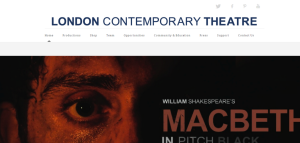
LCT homepageThe first impression gained from the home page of the London Contemporary Theatre’s website, is the consistent colour scheme throughout, with the performance artwork juxtaposing nicely with the font of the logo and website. There are also clear links to social media- twitter, Facebook, Pinterest and YouTube. So a customer gets the impression is that the theatre is communicating through various social networking sites using a variety of media.

Further down the page, there is a side panel informing the reader of their productions, but next to this, there is a rather squashed ‘What’s on’ section that provides a lot of information in a small space. It seems that the company focused on the initial impact of the homepage, but this attention to detail is not consistent.

Community & Education

There is a photograph of a beautiful building at the top of this page, however, after exploring the website, it was not clear why this particular photo was used. Sadly, the Community & Education section does not get much better from the first impression. The other photographs do not seem entirely relevant to the content and they are not particularly exciting or engaging. In addition to this, I do not like the lay out of the text. It seems disorganised and I feel that London Contemporary Theatre would benefit from experimenting with text colour.

Shop

The Online Shop

The Online Shop

The online shop/ box office page is also lacking. It has a very disjointed and confusing way of presenting, describing and selling tickets. It is also clear that there has not been a great deal of care involved in the presentation, as there are gaps separating paragraphs caused by photographs (see photograph to the right). The shop gives off a very bad impression to the customer. Despite these issues, I do like the basket section in the top left hand corner and the total amount in pounds on the right. I found this section the most disappointing from the whole website, which is worrying, as for a business, revenue is integral to success.

Twitter

At the top of the home page there is a panel that instantly connects you to the social media sites, which is very good. The Twitter account is generally positive- the art work is contemporary, there are behind the scenes photographs and the updates are useful. However, the cover photo has not been updated now that the theatre has moved on from Macbeth to the History Boys. In addition to this, although useful, the twitter updates are infrequent. In general, the twitter page is a good representation of the theatre, but there are a few issues that can be easily sorted.

Other Social Media

In addition to the Twitter, London Contemporary Theatre also have a Facebook, Pinterest and YouTube. The Facebook is much the same as the Twitter, with very similar updates, so I am focusing on the other two.

Empty Pinterest Page

Empty Pinterest Page

The theatre have recognised the importance and benefits of having a YouTube account, which they can also link to their Twitter and Facebook. However, rather like the Twitter, the YouTube has very infrequent updates, the last being 2 months ago and in total there is only 6 videos. Once again, like the Twitter, they have seen the opportunity but they fail to fully use the site to their advantage.

The biggest issue I have seen is the Pinterest account. There is a direct link to the page  on the website but it leads you to an account, with nothing. There are no boards, pins or followers. Understandably perhaps they have not had time to fully establish the account, but they should not have a link from the website. It comes across as very amateurish.

Strengths: The productions are very exciting and they speak for themselves. The chosen artwork for the productions are also very good. They also have just over 7,000 twitter followers.

Weaknesses: Inconsistencies in the branding throughout the website and social media sites. The lack of social networking activity is a poor reflection of the company. I feel unless there is the time to dedicate yourself to various media sites, do not spread yourself thin, as in some cases that can do more worse than good.

Opportunities: From this website, Reading Rep should recognise the importance of frequent updates on social media sites and relevancy of photographs. I hope it is also a lesson to show businesses that when it comes to social networking, it is better to have one account at a high standard, than be involved in too many sites and spreading yourselves thinly.

Threats: The issues London Contemporary Theatre are facing with their social media is threatening. They also need to proof read and take a step back from the website and view it as a customer. Hopefully that way the irrelevant photographs will be removed. The overall impression gained from their website and social networking is amateurish.

Definitions

swot analysis diagramAfter discovering S.W.O.T , P.E.S.T and their applications, I have focused on the former strategy and defined the application of them in my own way, to suit the nature of this assessment. Naturally, I am looking at ‘Strengths’ and ‘Weaknesses’ in the same way as any establishment would, but I have had to tailor my application of ‘Opportunities’ and ‘Threats’.

For this study, I am using the ‘Opportunities’ section to consider what the theatre I am assessing can do to improve their website. When writing this section I will also consider what what Reading Rep can learn, taken from these observations.

As this placement is focused on observation and advice from me, I am not  to going to consider the details of the businesses such as cash-flow issues or quality specification standards. Therefore I am going to use ‘Threats’ as a way to identify the issues the theatre companies face and the consequences of their problems in regards to customers.

S.W.O.T & P.E.S.T

The purpose of this placement and blog is not only to help Reading Rep, but to also aide my understanding of marketing and business. In the past I have done internships with marketing teams but, until I began this placement  I have never led an investigation. Therefore, I started with the basics and I have researched marketing processes used today. The following are the two most relevant to this project:

S.W.O.T

Strengths    Weaknesses     Opportunities     Threats

P.E.S.T

Political factors    Economic factors     Sociocultural factors     Technological factors

These processes have given me a structure to my analysis and research. I have used S.W.O.T more than P.E.S.T mainly because the former seems more relevant to this investigation. The criteria for P.E.S.T marketing suggests a consumer business on a larger scale. 

Therefore, the basis used for this marketing assessment is S.W.O.T, and hopefully this form of analysis will enable me to find useful information for Reading Rep.

The Chosen Ones…

In the United Kingdom alone there is an overwhelming number of theatres, and theatre companies that I could compare Reading Rep to. Therefore, I needed to devise a filter to help me decide the four companies I was going to analyse in comparison to Reading Rep.

drama maks

After discussing with Aidan, Paul and observing the website, I decided the filters would be as follows.

Firstly, location is important. Reading Rep is the only reparatory theatre company in Reading and Paul told me that one of his aims is to add to the culture of Reading town and Berkshire. Consequently I will be assessing The Progress Theatre in Reading. Although this theatre is currently quite different from Reading Rep, I want to see how their marketing addresses the people of Reading.

Secondly, Reading Rep is undeniably ambitious. Their plan is for the company to be established within the community, so in this case I am planning to look at Cheltenham’s Everyman Theatre. Cheltenham is my hometown and for most of my childhood, I went on school trips to this theatre to watch a range of productions. As it formed an important basis for my own dramatic interest and education, it will be useful to have a look at the marketing of the Everyman and other theatres like it to see what Reading Rep can learn from them.

The other criteria that has affected my decision is genre. As my placement is focused around The Nativity Play Goes Wrong, I am going to look at groups focusing on contemporary or modern theatre and the way they present these. Two helpful theatres I have found are the London Contemporary Theatre Company and the Faction Theatre Company, both in London.

The final chosen four are

If I need more inspiration, I am going to look at some of the following:

  • Donmar Warehouse, London http://www.donmarwarehouse.com
  • The Faction Theatre Company, London http://www.thefaction.org.uk/

A Post-Christmas Detox

As part of my English Literature degree, I am on placement with a theatre company called Reading Rep. The production I am going to focus on is The Nativity Goes Wrong, written by the Mischief Theatre Company for Reading Rep and the production of this ran from 22nd December to the 4th January 2014. They are a company under two years old, so they are still establishing themselves as artists and as a brand. I am going to assess what other more established theatres are upto ans see what feedback I can give Reading Rep. Hopefully my research can help Reading Rep to improve their presence online and in the local community.